Temperature Change Data Analysis Project With Excel:
Analyzing Global Temperature Change Across Income Levels by Country (1961-2019)
Introduction
This project explores valuable, reliable and actualized data on temperature change across the globe. The selected dataset for this project has a deep background through the unification of different methodologies and GHG & temperature stations & boxes. The organization that digitalized, organized and made this data publicly available is the “NASA Goddard Institute for Space Studies” through “GISTEMP” which stands for “GISS Surface Temperature Analysis”. This is a widely recognized and trusted source of global temperature that provides estimates of global surface temperature changes over time.
Temperature measurements date back to 1880, notably those conducted by Murray Mitchell. These early measurements suffered from lower precision due to coverage limited scope within the latitude range of 20-90°N. Later on, the basic GISS temperature analysis scheme was defined in the late 1970s by James Hansen when an upgraded method of estimating global temperature change was needed for comparison with one-dimensional global climate models. “The scheme was based on the finding that the correlation of temperature change was reasonably strong for stations separated by up to 1200 km, especially at middle and high latitudes” (NASA GISS). This method is in a constant process of improvement mainly through two roads: updates to the analysis method and expansions to the sources of raw data.
In 1980 the model was already on a robust level. The first published results showed that the regular tendency of global cooling after 1940 was small, and that there was a notable increment in the net global warming of about 0.4°C between 1880 and 1970. The subsequent years show an exponencial and constant increment of average temperatures, reaching a point of +-1°C, which is an abnormal and alarming change in relation to the usual temperature fluctuations measured since 1880 and through the holocene. On the other hand, this increment of net global temperature comes with dangerous consequences as different organizations around the world have warned society as a whole about the dangers of passing the first and famous threshold of +1.5°C.
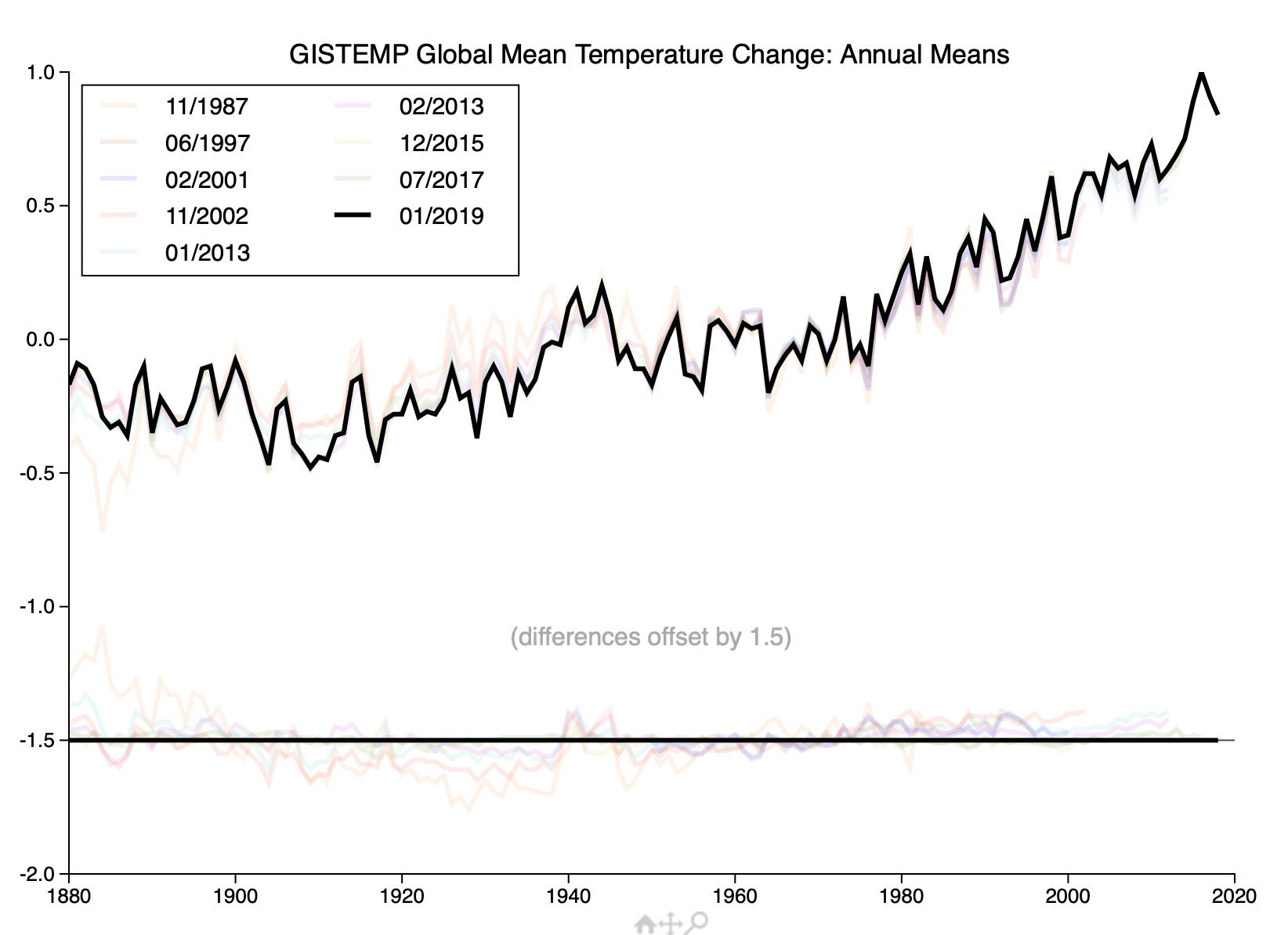
As we know, climate change is one of the most relevant topics currently in our society due to it’s planetary scale and deep humanitarian and ecological consequences. For this reason, it’s crucial to address this issue from various perspectives and leverage technology effectively.
Now, the specific approach selected for this project is to analyze temperature changes within a selected sample of the 4 income groups: 1) High-Income Countries, 2) Upper-Middle-Income-Countries, 3) Lower-Middle-Income-Countries, and 4) Low-Income-Countries. And as an extra and valuable insight provider, the groups mentioned will be compared to the AVG world temperature changes.
The main objective of this case study is to understand the temperature changes tendencies of each income group and uncover if a relevant correlation exists. For the specific objectives let’s go ahead and review the first section: ASK.
REFERENCES: https://blogs.worldbank.org/opendata/new-world-bank-country-classifications-income-level-2022-2023
https://data.giss.nasa.gov/gistemp/history/background.html
https://data.giss.nasa.gov/gistemp/history/
ASK
- ¿What are the temperature change tendencies on each income group? Are there relations within them, or differentiations with the others?
- ¿What is the relation of each income group with the worldwide change of temperature?
- ¿What is the temperature change behavior curve from 1961 to 2019?
- ¿What is the temperature change of each income group as of the latest year recorded on the dataset?
- ¿How many countries of each group has surpassed 0.48 C on avg? and how many countries have surpassed 1.5C on 2019?
- ¿What is the standard deviation average of each income group?
PREPARE
Importing the data set
Kaggle dataset reference: https://www.kaggle.com/datasets/sevgisarac/temperature-change?select=Environment_Temperature_change_E_All_Data_NOFLAG.csv
- The first step in the interaction with the dataset was downloading it from Kaggle, which provides tons of great resources for data science. The “Temperature Change” dataset was downloaded as a CSV file and imported to a new excel workbook. Text import wizard helped to specify the delimiters used in the CSV (e.g, comma, semicolon, tab, etc…). To end this initial process excel made a good job interpreting data formats and loading the data.
This are the columns of the dataset:
#: Area Code
A: Area
#: Months Code
A: Months
#: Element Code
A: Element
A: Unit
#: Y1961 to Y2019.
Data transformation
- First I focused on basic worksheet order by creating tables, name ranges, putting formats on order, erasing blanks, hiding unnecessary columns, adding the income groups column, and standardizing name variables.
- Main raw data worksheet will be maintained raw but hidden. From it I created others spreadsheets which will have specific purposes.
1. Navigation.
2. Data Visualization Sheets (2, 3, 4)
3. Raw Data (hidden).
4. Yearly TC by Income Groups.
5. Monthly TC by Income Groups.
6. Calculations.
7. Pivots.
8. Lookups.
Adding income groups data and making data unbiased
- It’s clear by now that the “Temperature Change” dataset is reliable, as it’s source comes from an historic construction of various scientific groups, and now it is managed and actualized by the NASA Goddard Institute for Space Studies.
- As the main objective of this case study is to understand the temperature changes tendencies of each income group, a new column has been added to the data spreadsheets: “Income Groups”. I extracted the data from the “World Bank country classifications by income level” and matched each country to it’s respective income group. To reduce bias, I decided to not take samples, so I filled the income groups with their respective countries. Also, I deleted geographical regions and specific categories that were not “available countries” in the World Bank dataset. This is to form a balanced dataset and avoid a biased analysis.
- As an extra for data transformation I divided one sheet for “Meteorological Year” analysis and other for “Monthly” temperature change analysis. This to have different approaches and a deeper understanding of the data. To align all the income groups with their respective countries on the “monthly analysis sheet” I used the Index-Match function( ), and finally used tables and filters to count the amount of countries of each income group.
High-Income Countries: Total Count = 58
Upper-Middle-Income-Countries: Total Count = 38
Lower-Middle-Income-Countries: Total Count = 47
Low-Income-Countries: Total Count = 19
World (as a single sheet) Temperature: yearly and monthly.
- It is also important to mention that the “Temperature Change” dataset provided by the NASA Goddard Institute for Space Studies is an open dataset presented in Kaggle for different purposes. This being said, and after considerable investigation and first adjustments to the dataset, it is safe to say this project is using “ROCCC Data”: Reliable, Original, Complete, Current, and Cited data.
*¡or actually… I have to get the data cleaner! this on the next section.
PROCESS
Data integrity
- ¿Do we have Clean data + alignment to objectives? = accurate conclusions.
- Clean data is data that’s complete, correct, and relevant to the problem you’re trying to solve.
Data Cleaning
- Inconsistent data:
- Temperature changes range (1961-2019) was set to “numbers format”.
- Duplicates where not found with filtering.
- Checked for white spaces with filters, and for security I used the clean ( ) function to remove possible white spaces and the main non-printing characters.
- Correct and manage Incorrect & Inaccurate data:
- Data Validation was added to the countries columns and the temperature change numbers.
- In the process of adding the income groups look-up-tables where created to facilitate the addition of this new data.
- Remove irrelevant & outdated data:
- I deleted the “# codes” of countries area, months and elements as they are not needed for this specific exercise. We are left with the following ordered and cleaned columns:
- Income group, Area, Months, Element, Unit, Years (1961-2019).
- I deleted the “# codes” of countries area, months and elements as they are not needed for this specific exercise. We are left with the following ordered and cleaned columns:
- Delete incomplete datas
- There are a considerable amount of countries that do not have their complete temperature change numbers on the dataset. Based on the calculations and analysis I need to make to achieve the objectives, I decided to handle this issue taking a balanced approach between retaining as much information as possible and ensuring the quality of the results.
- I decided to remove countries that had more than 50% of the temperature change numbers absent, as this can affect the consistency and reliability of results. Also, I gave preference of removal to countries that have a high standard deviation or a missing one. Usually a high number on this indicator means less reliability in predictions, but on climate change, this amplitude could mean extreme weather events, measurements errors or other irregularities. Finally, it’s important to mention that the income group with most blank spaces is the upper-middle-income group, and high-income in comparison with low-income did not presented relevant differences in this aspect.
Deleted countries where:- High-Income: Belgium, Croatia, Estonia, Nauru, Singapore, Slovakia, Lithuania, Luxembourg, Latvia, Slovenia
- Upper-Middle: Armenia, Belarus, Palau, Turkmenistan, North Macedonia, Montenegro, Marshall Islands, Kazakhstan, Georgia, Bosnia and Herzegovina, Azerbaijan, Serbia.
- Lower-Middle: Kyrgyzstan, Micronesia (Federated States of), Ukraine, Uzbekistan, Tajikistan.
- Low-Income: Eritrea, Ethiopia, South Sudan, Sudan, Burundi, Rwanda.
*Count of income groups was corrected in the prepare phase.
- Processing and polishing data:
- I added conditional formatting to the yearly and monthly temperature change data-sheets. The logic for the formatting rules are based on the global recognition that an increase of 1.5C represents a breaking point in which hydrometeorological consequences increment exponentially in intensity and recurrence; Integrating the consideration that biodiversity and the equilibrium of our world’s ecosystems are reaching heightened levels of vulnerability.
- The following image shows an alarming increment of temperatures from 1961 to 2019. Yellow cells are values between 1.0C and 1.49C, and red cells are temperatures above or equal than 1.5C.
The image speaks by itself: “Temperatures are on the rise”.

Standard Deviation:
I decided to include the standard deviation on the “process” phase as “missing standard deviation data from countries” was considered to be a relevant aspect when deleting incomplete data. Also, this concept indicates the extent to which individual data points in a data set differ from the average of the set. In the climate change scenario, a high standard deviation could mean that a country experiences higher levels of volatility or inconsistency; this applies mainly on the behavior of the temperature changes across the time, but it could also be related to data inconsistency.
- I created an average of all the countries on the meteorological year sheet and I got the following results:
- Average standard deviation of all income groups : “0.36”.
- High Income: “0.44”.
- Upper Middle Income: “0.32”.
- Lower Middle Income: “0.30”.
- Low Income: “0.31”.
- extra World Standard Deviation: «0.41”.
The exposed averages above show that the temperature change dataset maintains a standard deviation close to zero, which in terms of data consistency is a good sign. On the other hand, further standard deviation investigation would be needed to consider valid hydrometeorological correlations for each income group, as this numbers could be related to geographical temperature patterns, hydrometeorological anomalies, big industry changes, carbon sink ecosystem destruction, and others…
ANALYZE
1) ¿What are the temperature change tendencies on each income group? Are there relations within them, or differentiations with the others?
Generated calculation tables to explore the AVG, MAX and MIN temperature changes from different angles.

Highest TC Avg of all years: Low Income Countries with 0.51C
Lowest TC Avg of all years: Upper Middle Income = 0.45
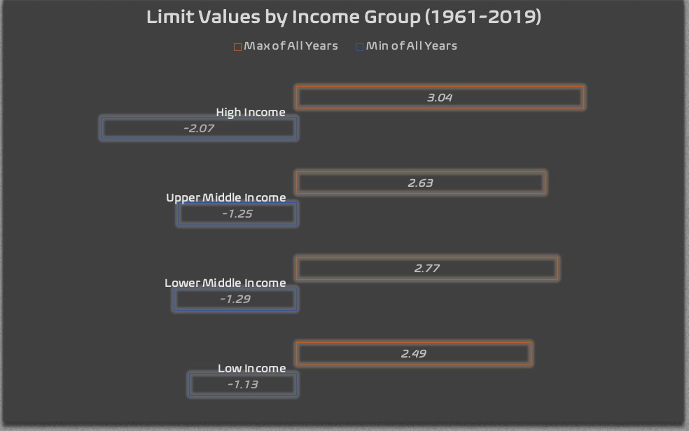
The following table shows “limit values” of each income group.

Max Value: High Income = 3.04C
Min Value: High Income = -2.07C
Also, I extracted data points on the limits of individual countries within each income group, this, to get to know the dataset on a deeper level.

High Income Countries:
– Country with highest Max-Avg through all years: Austria 0.75
– Country with highest Max TC: Greenland = 3.04C
– Country with lowest Min TC: Greenland = -2.07C
Upper-Middle-Income country:
Country with highest Max-Avg through all years: Russian Federation = 1.40C (avg is notably higher because TC data has been collected since 1992, which are years noticeably hotter). In 2nd place we have:
– Jamaica = 0.60C, which has more constant data since 1961, and is closer to the Upper Middle Income average.
– Country with highest Max TC: Turkey = 2.63C
– Country with lowest Min TC: Turkey = -1.25C
Lower-Middle-Income-Countries:
– Country with highest Max-Avg through all years: Mongolia = 0.85C
– Country with highest Max TC: Mongolia = 2.77C
– Country with lowest Min TC: Morocco = -1.29C
Low-Income-Countries:
– Country with highest Max-Avg through all years: Gambia = 0.82C
– Country with highest Max TC: Syrian Arab Republic = 2.49C
– Country with lowest Min TC: Afghanistan = -1.13C
¿Which Country has highest & lowest max-avg & min-avg in TC across time? And to which income group this country belongs?
- Highest Max-Avg TC: Lower Middle Country “Mongolia” = 0.85C
- Lowest Min-Avg TC: Upper Middle Income “Jamaica” = 0.60
¿To which income group belongs the highest and lowest value average through all years?
- Country with highest Max TC value: High Income Country “Greenland” = 3.04C
- Country with lowest Min TC value: High Income Country “Greenland” = -2.07C
Sorted and filtered the top 10 countries with the highest temperature change across time.
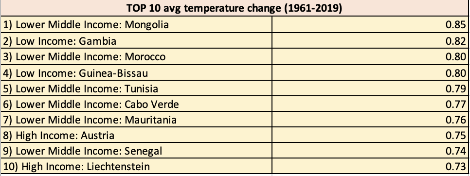
2) ¿What is the relation of each income group with the worldwide change of temperature?

All Income Groups Data (World Summary):
Avg (1961-2019): 0.48C
Avg Max Value (1961-2019): 1.75C
Avg Min Value (1961-2019): -0.61C
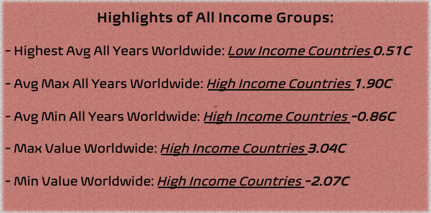
Highlights of All Income Groups:
**Highest Avg All Years Worldwide *** Low Income Countries 0.51C
**Avg Max All Years Worldwide *** High Income Countries 1.90C
**Avg Min All Years Worldwide *** High Income Countries -0.86C
**Max Value Worldwide *** High Income Countries 3.04C
**Min Value Worldwide *** High Income Countries -2.07C
*Low Income Countries have maintained the Highest Avg TC increment from 1961 to 2019.
*High Income Countries have presented the Max-Avg and Min-Avg values through all the years (1961-2019), as well as the Highest and Lowest values. The presence of the highest and lowest values suggests that these countries have undergone more significant temperature variations since 1961, indicating a broader amplitude of Temperature Change (TC) as time progresses.
3) ¿What is the temperature change behavior curve from 1961 to 2019?
- Designed a table with Avg Temperature Change by Income Group from 1961 to 2019 to visualize patterns and tendencies throughout all the years.
- Used pivot charts to visualize monthly temperature trends for each income group from 1961 to 2019, with intervals of 20 years.
*Visualizations will be presented on the share phase.
4) ¿What is the temperature change of each income group as of the latest year recorded on the dataset?

Used PivotTables to find the average temperature change for each income group in 2019.
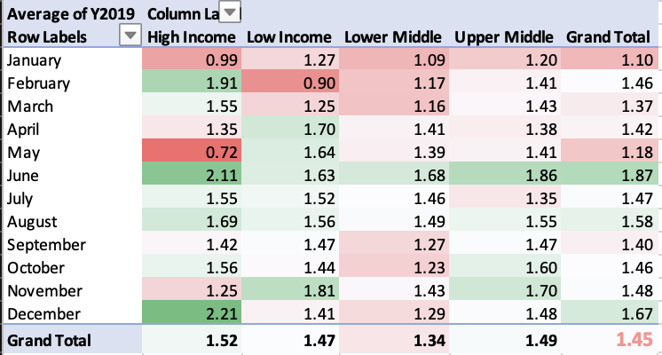
5) ¿How many countries of each group has surpassed 0.48 C on avg? and how many countries have surpassed 1.5C on 2019?
Used nested functions to determine how many countries in each group have surpassed 0.48°C avg temperature raise.

Used nested functions analyze which income group, on average, has surpassed the threshold of 1.5C on 2019.

SHARE
1) ¿What are the temperature change tendencies on each income group? Are there relations within them, or differentiations with the others?
2) ¿What is the relation of each income group with the worldwide change of temperature?
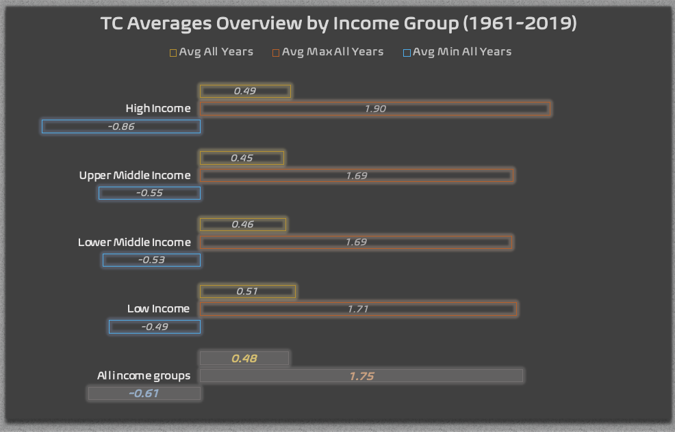
The first graphic shows us different angles of the data compiled from 1961 to 2019 of each income group. The averages of each income group are relevant data points as they represent a solid indicator of temperature change throughout time.
- Highest temperature change Avg of all years, which is represented by the Low Income Countries with 0.51C. This places the low income countries as the group that has been most affected by a constant increment of temperature since 1961. This is a relevant result as the low income countries represent the smallest influence in climate change, but are one of the most affected groups.
- Lowest temperature change Avg of all years which is taken by the Upper Middle Income Countries = 0.45C. This group has maintained the lowest average increment of temperatures compared to the other groups.
- This graphic also reveals that High Income Countries have the highest MaxValue Avg = 1.90C, as well as the lowest MinValue Avg = 0.86 of all the income groups. This phenomenon can be attributed to various factors, but one crucial aspect to highlight is that high-income countries began with the lowest temperature values and experienced the most significant increase over the years. In contrast, other countries maintained a more consistent upward trend in temperatures. This is confirmed the graphic above where limit data points are illustrated, showing that high income countries have the highest and lowest values of all years.
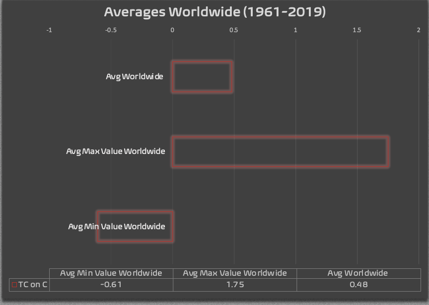
This third graphic shows us a good view of the temperature change behavior from 1961 to 2019 and can help us answer our second question “¿What is the relation of each income group with the worldwide change of temperature?”. After reviewing the values one can recognize that the High and Low Income countries are above the global average of temperature change, while the “middle countries” are below average.
For High-Income Countries, this might be attributed to the significant increase in temperatures observed from 1961 to 2019. Additionally, they hold the highest Max and Min values compared to the other income groups. This data could have a lot of different explanations, but it is worth to mention that high-income countries are the most significant contributors to greenhouse gas (GHG) emissions. The notable increase in temperature over the years might be attributed to the substantial annual emissions, influencing the atmospheric conditions and the natural climate patterns of their respective geographical regions.
On the other hand, Low-Income Countries also stand above the average of temperature change across the years, but the increment has been less pronounced and more constant in comparison to high-income countries. As it is known in the scientific community, low-income countries stand as the group that contributes less GHG emissions compared to their counterparts. However, on average, they are more severely impacted by climate change. This is attributed to the inherent geographical and meteorological characteristics of these nations, the global rise in GHG concentrations, and their lower levels of resilience and adaptation to climate change.


This final graphic for Q1 & Q2 shows us the top 10 average temperature change countries from 1961 to 2019. The results where divided on the “High End Group: high income & upper middle” and “Low End Group: lower middle & low income”. The small table indicates a remarcable difference: from a 100% of all the countries, 80% of the top 10 avgs belong to the low end group, which reinforces two consequences: 1) The low end group has had a more constant increment of temperature change throughout the years. And 2) low end groups have been more affected throughout the years by temperature change as the avg temperature changes have been higher than the high end group, adding the fact that these countries have less capacity for mitigation and adaptation.
3) ¿What is the temperature change behavior curve from 1961 to 2019?
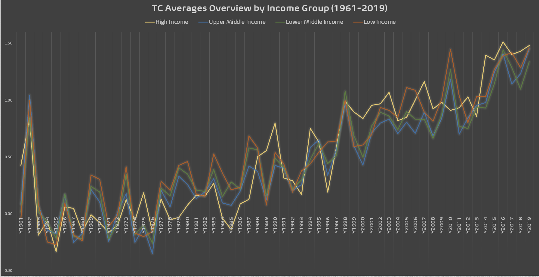
This line chart exposes the average temperature change behavior over the years. The key takeaway from this visualization is that all income groups, collectively representing the world, have consistently experienced a rise in temperature. Notably, each income group is approaching the 1.5°C limit established by the United Nations. The upward trend observed across all groups in 2019 implies the possibility of future years exceeding previous records in terms of temperature rise. This aligns with scientific studies revealing that 2023 has been identified as the hottest year on record, marked by the breaking of numerous temperature records.
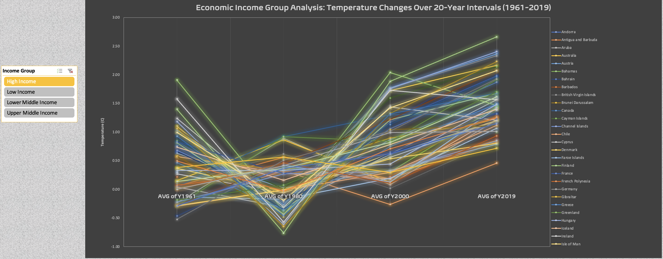
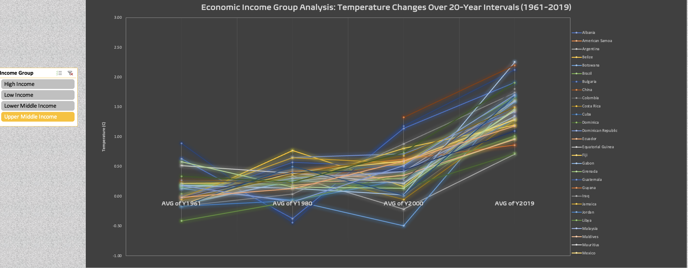
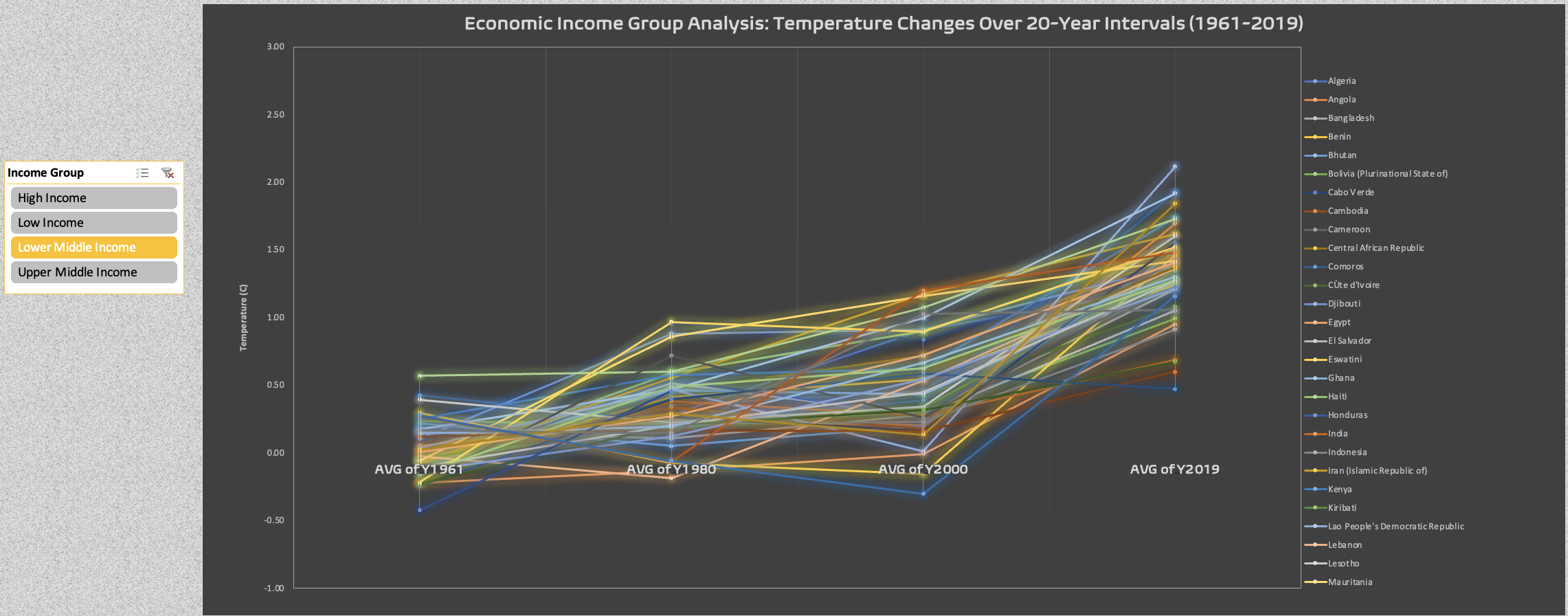
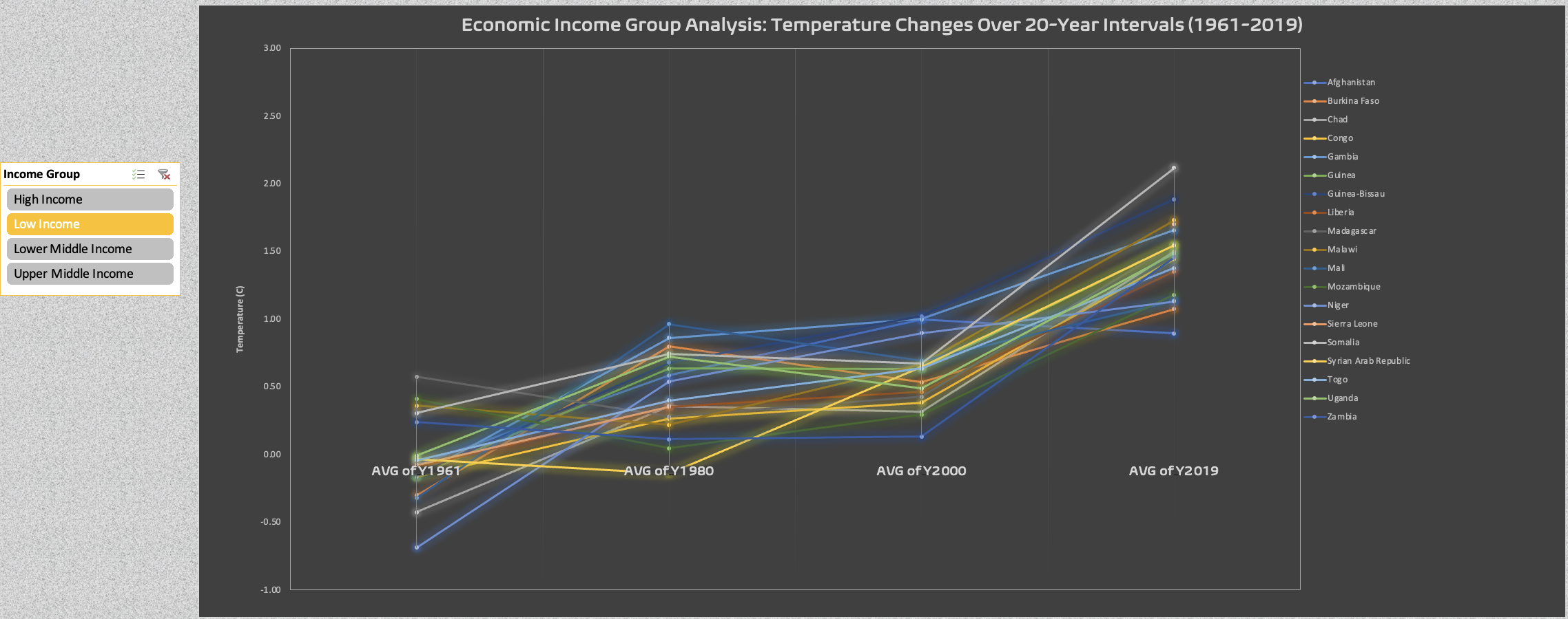
The following graphics illustrate the temperature change avg for each income group and specific country over 20 years-intervals (1961-2019). Feel free to find your country or countries of interest!
4) ¿What is the temperature change of each income group as of the latest year recorded on the dataset?
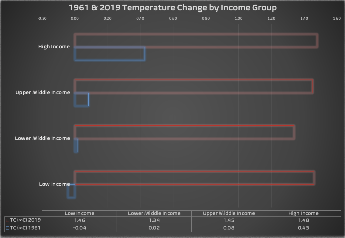
First graphic portrays the notable difference of temperature change from 1961 to 2019. High and Low income countries are just 2 to 4 degrees celsius away to reach the threshold of 1.5C accorded by the United Nations. Upper middle countries are also very close to the mark with 1.45C. The lower middle income group is the one that maintains the highest distance to this threshold with an avg of 1.34C increment on 2019.
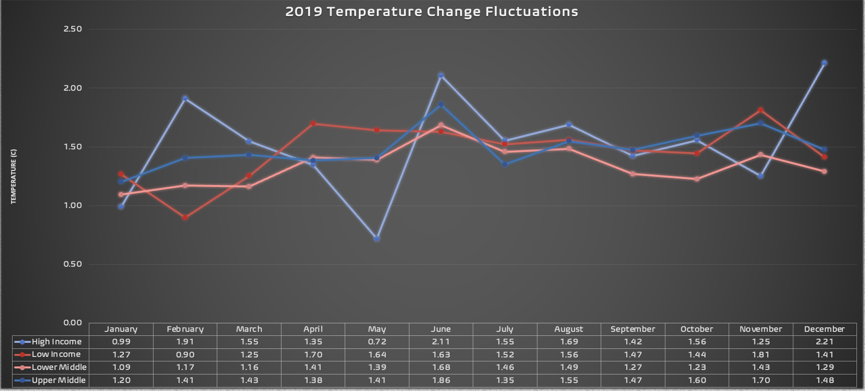
The second graphics exhibits a clearer picture of temperature change with a year (2019). High Income and Upper-Middle countries present a more volatile temperature behavior than the lower half, which maintains more balanced fluctuations.
5) ¿How many countries of each group has surpassed 0.48 C on avg? and how many countries have surpassed 1.5C on 2019?

The graphs on this last question work with a “100%” based on the count of countries that comply with a specific logic, which is countries that have >0.48C avg and ≥1.5C (2019). Since each income group comprises a different number of countries, the percentages have been normalized, ensuring that the pie chart reflects each income group in a balanced manner. To achieve this, each income group has generated a «self-percentage (%)» based on the defined criteria for each graph. Although the sum of these self-percentages exceeds 100%, this total (160.5%) has been recalibrated to represent the new 100%. Consequently, the pie charts portray an unbiased percentage of each income group relative to the specified conditions.
*working with self percentage
Now, for the first graph we can deduct by simple observation that the low-income countries have the lead in the percentage of countries within it’s group exceeding the avg temperature change (0.48°C). Following closely, we find high-income countries, comprising 28% of their group, and lastly, the middle-income groups with smaller percentages.
The next graph illustrates the percentage of countries experiencing a temperature change equal to or greater than 1.5°C on 2019. Low-income countries maintain their lead with 28% of their countries meeting this criteria. Notably, upper-middle-income countries show a remarkable increase from 18% (from the >0.48 AvgTC condition) to 28% of their countries surpassing or equaling 1.5°C in 2019. This signals a substantial rise in temperature change for this income group, aligning more closely with the trend observed in high-income countries, which have recorded numerous instances surpassing the specified threshold by the United Nations. In contrast, lower-middle-income countries exhibit the smallest percentage of countries within their group surpassing the 1.5°C threshold.
*working with total percentage of all groups
As a final addition to this last question, and as an alarming data point, two calculations were conducted to determine the percentage of countries and groups globally that surpass both the global average throughout the years (0.48°C) and the threshold of 1.5°C or higher in 2019. The resulting calculations unveiled the following concerning figures:
- Percentage of Countries Above 0.48C (1961-2019): 38.89%
- Percentage of Countries Above 1.5C in 2019: 37.04%
ACT
Insights analysis summary
After passing through the 6 phase data analysis process on the global temperature change data set provided by the NASA Goddard Institute for Space Studies” I have arrived to the following key points insights to considerate.
- Low-income countries, despite contributing less to emissions, exhibit some of the highest values in temperature increment both over the years and on the latest year recorded on this study (2019). This suggests that low-income countries are significantly influenced by and vulnerable to the presence of climate change.
- High-income countries are the most significant contributors to GHG emissions (which are the major drivers of climate change) and have experienced the most significant temperature increase since 1961. The connection between high-income status, high emissions & pronounced temperature change suggest correlations between economic prosperity and environmental impact.
- The world is approaching the 1.5°C limit threshold set by the United Nations, posing serious risks for all income groups. With rising average temperatures, hydro-meteorological and biodiversity disasters are becoming more frequent and intense.
- The data unmistakably exposes a continual rise in average temperature change over the years, showcasing the unsustainability of our current system. This study demonstrates the urgency to take stronger climate action.
Conclusions and call to action
The data speaks clearly on this study, temperature has been on the rise since 1961, marking a crucial period in the global collection of temperature change data. The trajectory from 1961 to 2019 follows an alarming upward direction, nearing the critical threshold of 1.5°C established by the United Nations. It is scientific consensus that beyond this point the world will experience an exponencial increment of hydrometeorological disasters, both in frequency and intensity. Additionally, surpassing this threshold will result in a gradual impact on biodiversity and the spread of viruses globally, consequently leading to a decline in the vital natural services provided by nature. This, in turn, heightens vulnerability to human well-being.
The data exposes the urgent need for global climate action, emphasizing the necessity to prioritize and address this situation with the urgency it demands. Sustainability based on climate action for mitigation and adaptation should be on the top of the countries priorities, specially for the high-income countries, as they have a wider variety of resources based on a more developed economy and technological assets. This group should be focused on continuing normalizing sustainable development, reaching net zero targets, as well as supporting countries in development with specific environmental or humanitarian challenges. High-income countries must have a normalized view of sustainability and an open-posture to help more vulnerable countries, and even pay the ecological debts generated over the years.
On the other hand, low-income countries should prioritize adaptation, considering their less-significative contributions to emissions and the emergence of effects from the rising temperature, which can compromise their capacity to build a dignified life with similar opportunities than countries in higher income levels. Upper-middle and lower-middle countries should have a balanced approach in addressing climate change, generating both adaptation and mitigation measurement’s; and if necessary finding support from high-income countries. This groups should also focus on constructing their development maintaining “sustainable development” as their guiding principle. It’s essential to recognize that an economy based on sustainability is viable, and there’s no necessity to continue exploiting resources that emit greenhouse gases to achieve economic development.
¿Interested in going deeper? Explore the data on the excel workbook I developed this case study:
